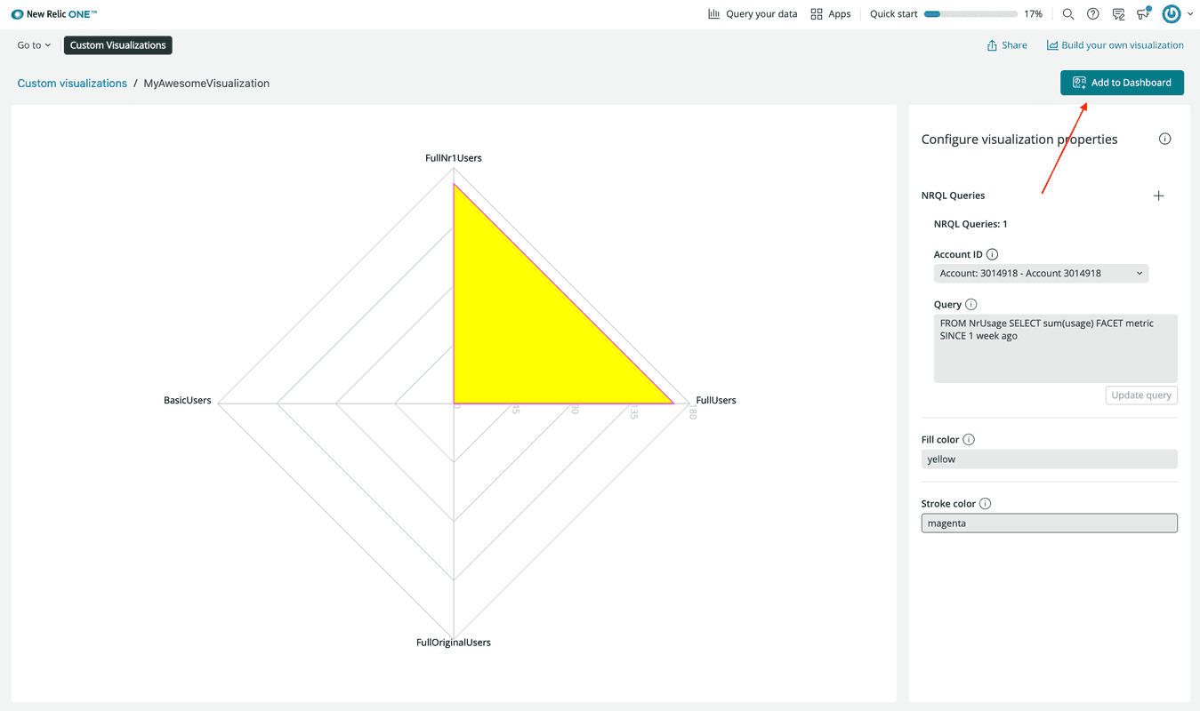
Query data from any source and display it on your New Relic dashboard with custom visualizations.
In this guide, you learn how to:
- Use the
nr1CLI to generate a default visualization - Run your visualization locally where you can quickly test and iterate
- Publish your visualization to the New Relic app catalog
- Add your visualization to a dashboard
Before you begin
If you haven't already:
- Sign up for a New Relic account
- Install Node.js
- Complete the steps in the
nr1quick start to install and configure the CLI
Create a new visualization
Use nr1 to generate the boilerplate for a new visualization.
Ensure you're working with the latest version of the New Relic One CLI:
$nr1 updateCreate a visualization, called my-awesome-visualization, in a Nerdpack, called my-awesome-nerdpack:
$nr1 create --type visualization --name my-awesome-visualization✔ You are attempting to create a nerdlet outside of a nerdpack. We will create a nerdpack for you. What would you like to name it? ... my-awesome-nerdpack✔ nerdpack created successfully! nerdpack my-awesome-nerdpack is available at "./my-awesome-nerdpack"✔ visualization created successfully! visualization my-awesome-visualization is available at "./my-awesome-nerdpack/visualizations/my-awesome-visualization"Tip
If you receive a RequestError for a self-signed certificate when you run nr1 create, you may need to add a certificate to Node's certificate chain. Read more about this and other advanced configurations in Enable advanced configurations for your Nerdpack.
As a result, you have a new visualizations/my-awesome-visualization directory in my-awesome-nerdpack:
$ls my-awesome-nerdpack/visualizations/my-awesome-visualizationindex.js nr1.json styles.scssThe top-level visualizations directory holds all of your Nerdpack's visualizations. The visualization you created is called my-awesome-visualization, and it has its own directory. The files in this directory provide an example visualization—a RadarChart populated by a basic NRQL query.
Files
- nr1.json provides metadata for your visualization. The
configurationkey in this metadata defines the prop-input fields to be shown in the UI. To learn more about the options available under theconfigurationkey, check out the Configure your custom visualization article. - index.js defines the React component that receives the props defined in nr1.json and renders your visualization. You can install and import any JavaScript libraries you find useful. The example component imports Recharts, a library that wraps D3 submodules for easy-to-compose visualizations.
- styles.scss defines the Sass styles for your visualization
Serve your visualization locally
Serve your visualization locally, and view it in Apps > Custom Visualizations. There, you can quickly test changes to your code.
From the root directory of your Nerdpack, start a local Node server:
$cd my-awesome-nerdpack$nr1 nerdpack:serveWhile it's running, your local server recognizes changes to certain files, such as index.js and automatically refreshes your visualization. However, it doesn't recognize changes to nr1.json or styles.scss. Therefore, some changes, such as those to the definition of the configuration field in nr1.json, won't be reflected in your visualization until you restart your server. To see changes to those files, stop the server, with CTRL+C, and start it back up with nr1 nerdpack:serve.
Open the link to your visualization that's shown in the terminal when the Node server starts:
Visualizations:⁎ my-awesome-visualization https://one.nr/012ab3cd4EfUpdate the fields under Configure visualization properties, and watch your visualization update automatically:
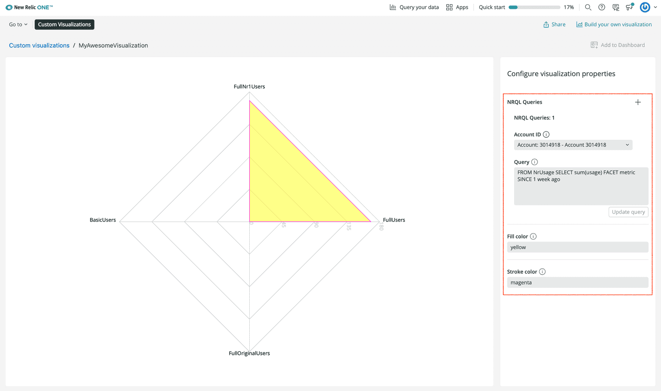
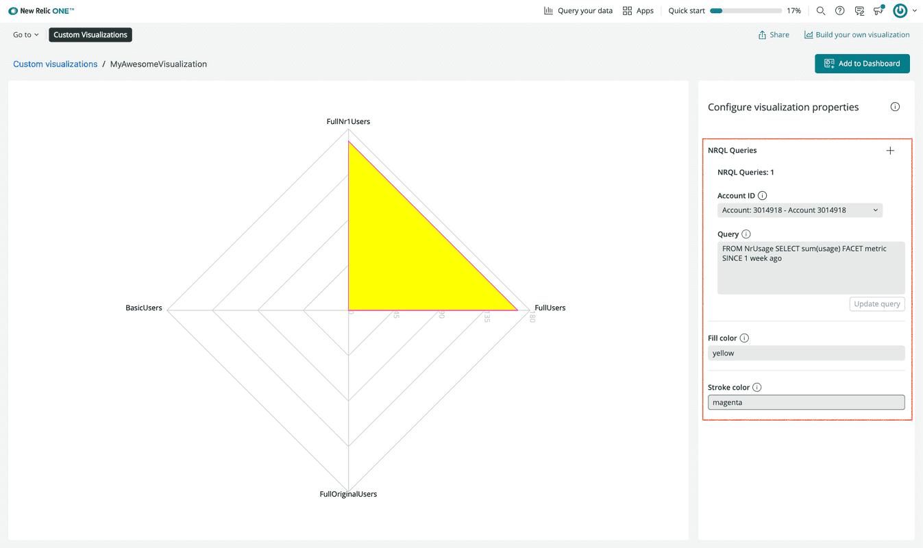
To add more of these properties, update the configuration field in nr1.json, and restart your local server.
Configuring these properties is one way to update your visualization. Changing your React code is another.
In index.js, change your component's Radar.fillOpacity:
1import React from 'react';2import PropTypes from 'prop-types';3import {4 Radar,5 RadarChart,6 PolarGrid,7 PolarAngleAxis,8 PolarRadiusAxis,9} from 'recharts';10import {Card, CardBody, HeadingText, NrqlQuery, Spinner, AutoSizer} from 'nr1';11
12export default class MyAwesomeVisualizationVisualization extends React.Component {13 // Custom props you wish to be configurable in the UI must also be defined in14 // the nr1.json file for the visualization. See docs for more details.15 static propTypes = {16 /**17 * A fill color to override the default fill color. This is an example of18 * a custom chart configuration.19 */20 fill: PropTypes.string,21
22 /**23 * A stroke color to override the default stroke color. This is an example of24 * a custom chart configuration.25 */26 stroke: PropTypes.string,27 /**28 * An array of objects consisting of a nrql `query` and `accountId`.29 * This should be a standard prop for any NRQL based visualizations.30 */31 nrqlQueries: PropTypes.arrayOf(32 PropTypes.shape({33 accountId: PropTypes.number,34 query: PropTypes.string,35 })36 ),37 };38
39 /**40 * Restructure the data for a non-time-series, facet-based NRQL query into a41 * form accepted by the Recharts library's RadarChart.42 * (https://recharts.org/api/RadarChart).43 */44 transformData = (rawData) => {45 return rawData.map((entry) => ({46 name: entry.metadata.name,47 // Only grabbing the first data value because this is not time-series data.48 value: entry.data[0].y,49 }));50 };51
52 /**53 * Format the given axis tick's numeric value into a string for display.54 */55 formatTick = (value) => {56 return value.toLocaleString();57 };58
59 render() {60 const {nrqlQueries, stroke, fill} = this.props;61
62 const nrqlQueryPropsAvailable =63 nrqlQueries &&64 nrqlQueries[0] &&65 nrqlQueries[0].accountId &&66 nrqlQueries[0].query;67
68 if (!nrqlQueryPropsAvailable) {69 return <EmptyState />;70 }71
72 return (73 <AutoSizer>74 {({width, height}) => (75 <NrqlQuery76 query={nrqlQueries[0].query}77 accountId={parseInt(nrqlQueries[0].accountId)}78 pollInterval={NrqlQuery.AUTO_POLL_INTERVAL}79 >80 {({data, loading, error}) => {81 if (loading) {82 return <Spinner />;83 }84
85 if (error) {86 return <ErrorState />;87 }88
89 const transformedData = this.transformData(data);90
91 return (92 <RadarChart93 width={width}94 height={height}95 data={transformedData}96 >97 <PolarGrid />98 <PolarAngleAxis dataKey="name" />99 <PolarRadiusAxis tickFormatter={this.formatTick} />100 <Radar101 dataKey="value"102 stroke={stroke || '#51C9B7'}103 fill={fill || '#51C9B7'}104 fillOpacity={1.0}105 />106 </RadarChart>107 );108 }}109 </NrqlQuery>110 )}111 </AutoSizer>112 );113 }114}115
116const EmptyState = () => (117 <Card className="EmptyState">118 <CardBody className="EmptyState-cardBody">119 <HeadingText120 spacingType={[HeadingText.SPACING_TYPE.LARGE]}121 type={HeadingText.TYPE.HEADING_3}122 >123 Please provide at least one NRQL query & account ID pair124 </HeadingText>125 <HeadingText126 spacingType={[HeadingText.SPACING_TYPE.MEDIUM]}127 type={HeadingText.TYPE.HEADING_4}128 >129 An example NRQL query you can try is:130 </HeadingText>131 <code>FROM NrUsage SELECT sum(usage) FACET metric SINCE 1 week ago</code>132 </CardBody>133 </Card>134);135
136const ErrorState = () => (137 <Card className="ErrorState">138 <CardBody className="ErrorState-cardBody">139 <HeadingText140 className="ErrorState-headingText"141 spacingType={[HeadingText.SPACING_TYPE.LARGE]}142 type={HeadingText.TYPE.HEADING_3}143 >144 Oops! Something went wrong.145 </HeadingText>146 </CardBody>147 </Card>148);Look at your visualization in the New Relic platform to see the change:
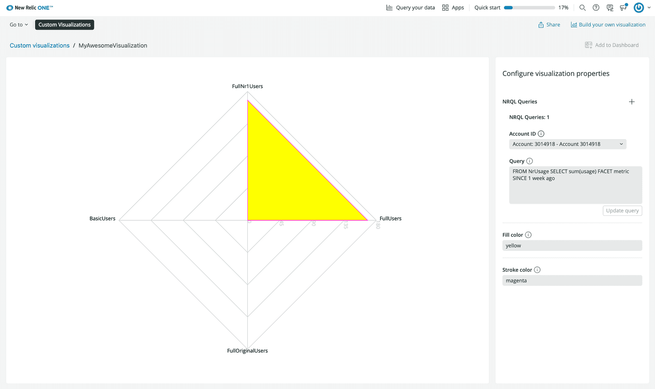
Now you've seen how to:
- Serve your visualization locally
- View it in New Relic platform
- Update the visualization with configurable properties and code changes
Once you've developed and configured a chart to show your data in an effective way, you can save that instance of the chart, complete with your configurations and the data or query, in a dashboard. However, you can't do this with a locally served visualization. You need to publish your visualization, first.
Publish and use your visualization
To add an instance of your visualization to a dashboard, you first need to publish your Nerdpack.
Publish your Nerdpack from its root directory:
$nr1 nerdpack:publishLook for a success message in your output:
✔ Nerdpack published successfully!✔ Tagged 5f4c2af8-3b27-40b5-954c-356d1ef88dd0 version 1.0.0 as STABLE.This means that your Nerdpack was published to the New Relic app catalog that you can find under Apps.
Subscribe to your Nerdpack:
$nr1 nerdpack:subscribeSubscribed account 3014918 to the nerdpack 5f4c2af8-3b27-40b5-954c-356d1ef88dd0 on the STABLE channel.Now, you're subscribed to your Nerdpack and can build an instance of a visualization in New Relic.
Once again, open the Apps page at New Relic:
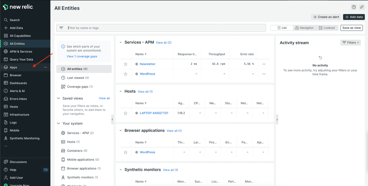
Here, you don't need to use the ?nerdpacks=local query string because you're looking for a visualization that you've published and subscribed to, rather than one that is locally served.
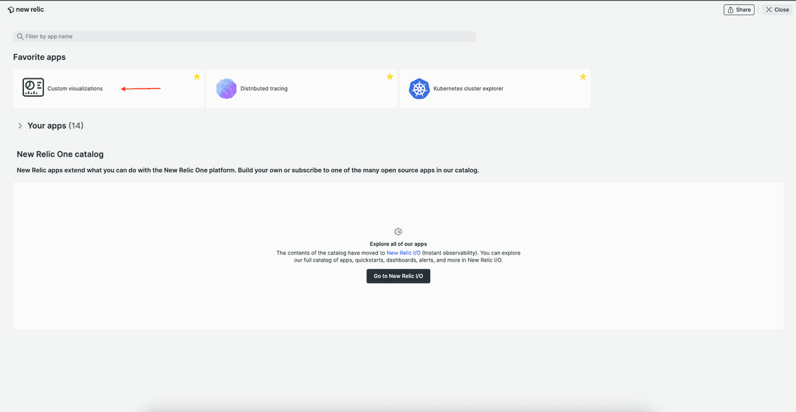
Go to Custom Visualizations:
Find and click your published visualization:
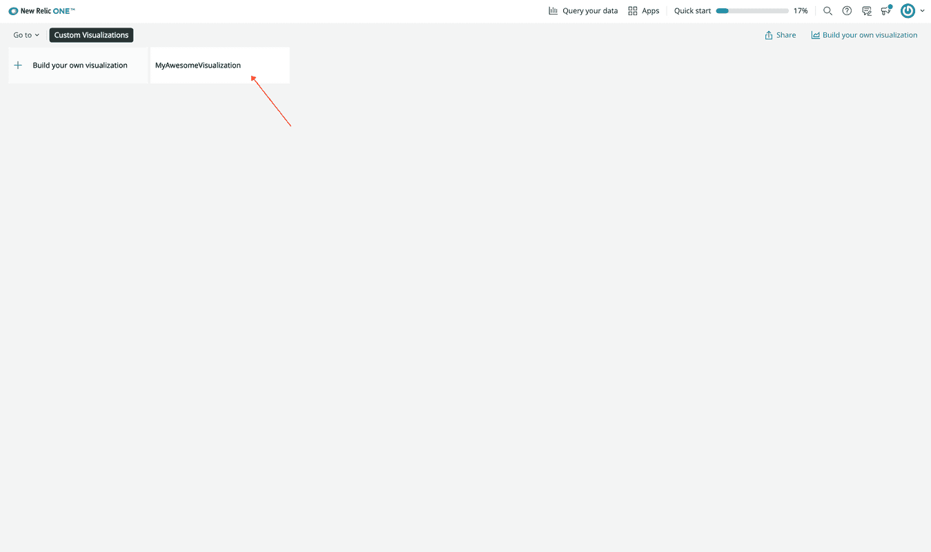
You may have to refresh your browser page if you can't find your visualization.
Notice that this new tile no longer has a </> Local label. This is because you're looking at the visualization you published and subscribed to in the previous steps. If you're still serving your Nerdpack locally, you might see two tiles here, one with the label and one without it.
Configure your visualization the same way you did when it was locally served:
From the homepage, go to Dashboards:
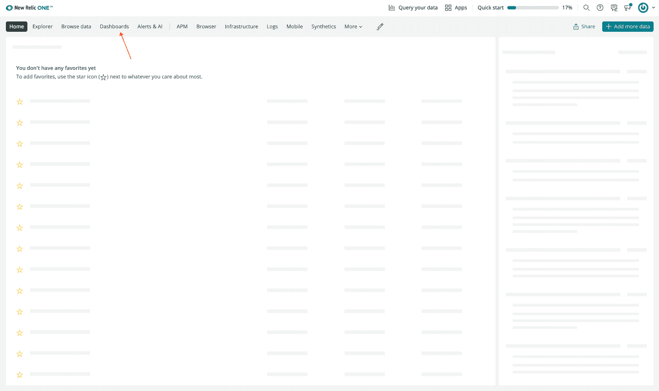
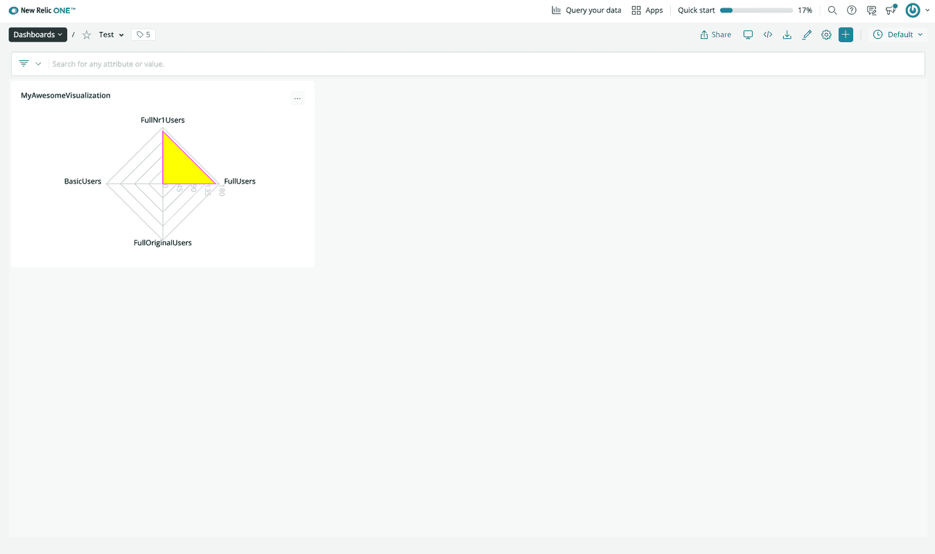
Select the dashboard you added your visualization to and see your visualization in it:
Summary
Congratulations on building your first visualization! In this guide, you learned how to:
- Create a visualization
- Serve your visualization locally
- Iterate on visualization code changes and customizations in Custom Visualizations
- Publish your visualization
- Subscribe to your visualization
- Add your visualization to a dashboard
Additional resources
- New Relic Quick Tips video: Dashboards and Custom Visualizations (6 minutes)
- New Relic NerdBytes video: Configuring custom visualizations for dashboards (7 minutes)
- New Relic Changelog live stream: Custom Data Visualizations on New Relic (30 minutes)
