When you create a dashboard, you add a variety of charts to visualize your New Relic telemetry data. These charts, offered out-of-the-box, are customizable in that you can:
- Resize and arrange their positions in your dashboard
- Update their names, display options, and underlying data queries
But sometimes the charts we include in the platform aren't enough for you to get the most from your data. When you want to visualize your data in a specific way that isn't possible with our charts, you can build a custom visualization.
New Relic is programmable. This means that if the platform doesn't solve your specific problem, you can write and deploy your own code to fill in some of those gaps.
One area where programmability is valuable is in visualizing your data. While New Relic offers all the telemetry data that your apps and services report and provides many different kinds of charts to present that data, you might need to create something entirely unique.
With the New Relic One SDK, we've provided you all the tools you'll need to create your own visualizations.
Permissions
For details about permissions, see Permissions.
Build your custom visualization
With the New Relic One SDK, you can create a Nerdpack, which houses your visualization code. This code consists of a React component, logic, data queries, and external dependencies. The SDK also provides a component library that you can use to make NerdGraph requests, access platform state context, and more.
Check out this video showing how to create a custom visualization (8:14 minutes).
Your first visualization
To build your first custom visualization, install the New Relic One SDK and make sure you have the latest version:
$nr1 updateCreate a Nerdpack and a visualization:
$nr1 create --type visualization --name custom-viz✔ You are attempting to create a nerdlet outside of a nerdpack. We will create a nerdpack for you. What would you like to name it? ...my-first-viz✔ nerdpack created successfully! nerdpack my-first-viz is available at "./my-first-viz"✔ visualization created successfully! visualization custom-viz is available at "./my-first-viz/visualizations/custom-viz"The visualization you created in the my-first-viz Nerdpack contains a default component to help you get started.
Serve your visualization locally:
$cd my-first-viz$nr1 nerdpack:serveOpen the link to your visualization that's shown in the terminal when the Node server starts:
Visualizations: ⁎ custom-viz https://one.nr/012ab3cd4Ef

Important
To view the locally served visualization, you must use the nerdpacks=local querystring.
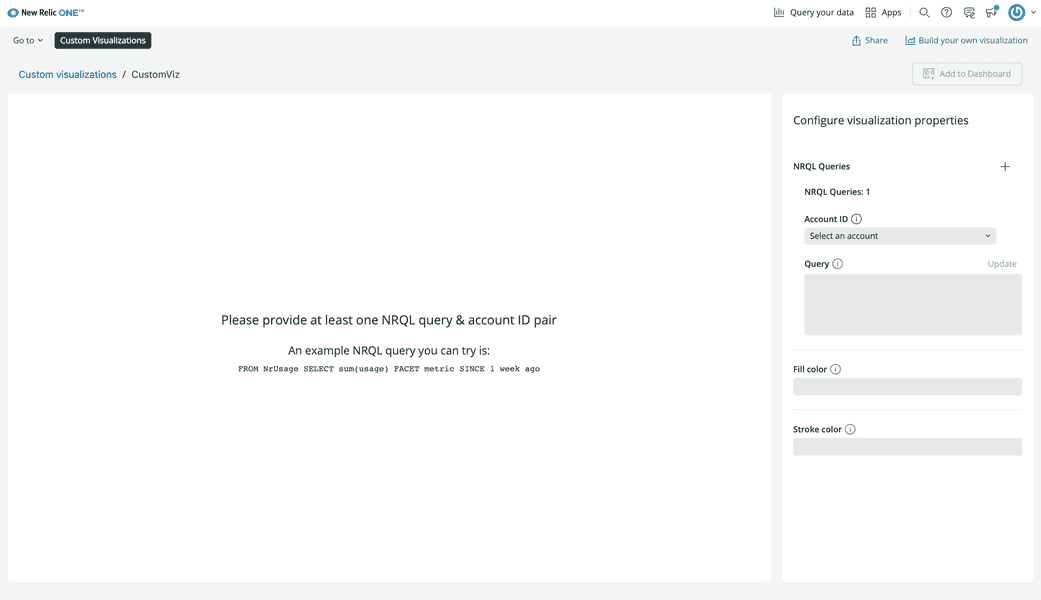
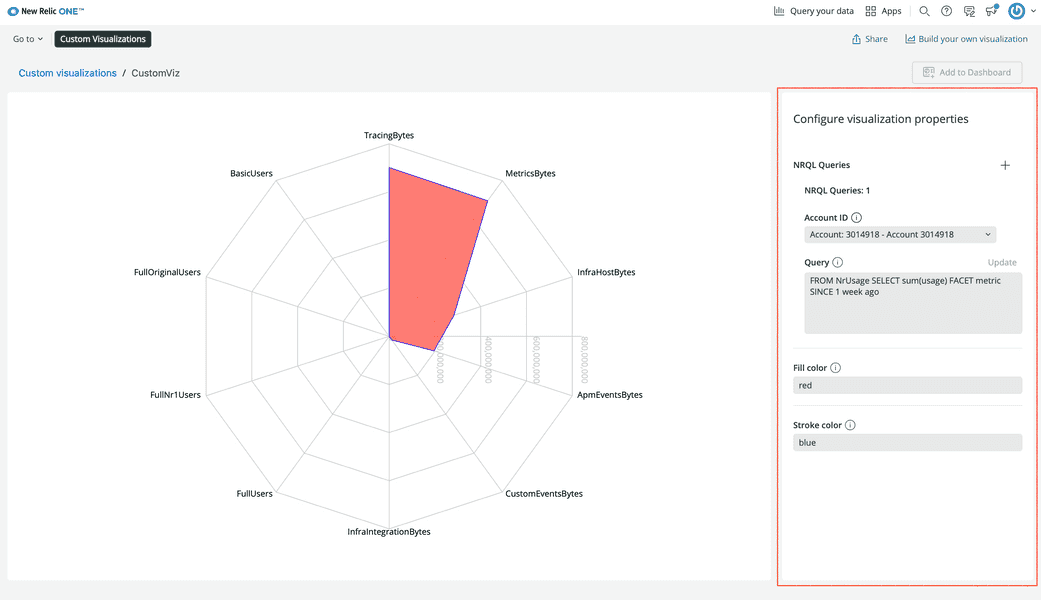
Enter values into the fields under Configure visualization properties and see how the chart changes:

Resources
Here is a list of resources for building custom visualizations:
- Build a custom visualization for dashboards (Guide)
- Custom visualizations and the New Relic One SDK (Guide)
- Dashboards and Custom Visualizations (Video)
Customize your visualization
You have a lot of control over how your visualization operates. You can choose what properties of the visualization are customizable, such as colors, sizes, and how you present your legend. You can choose whether it presents New Relic data or data from an external source. You can even install and use third-party components to create a specific look:

Resources
Here is a list of resources for configuring custom visualizations:
- Configuration options (Documentation)
- Customize visualizations with configuration (Guide)
- Configuring custom visualizations for dashboards (Video)
Use your custom visualization
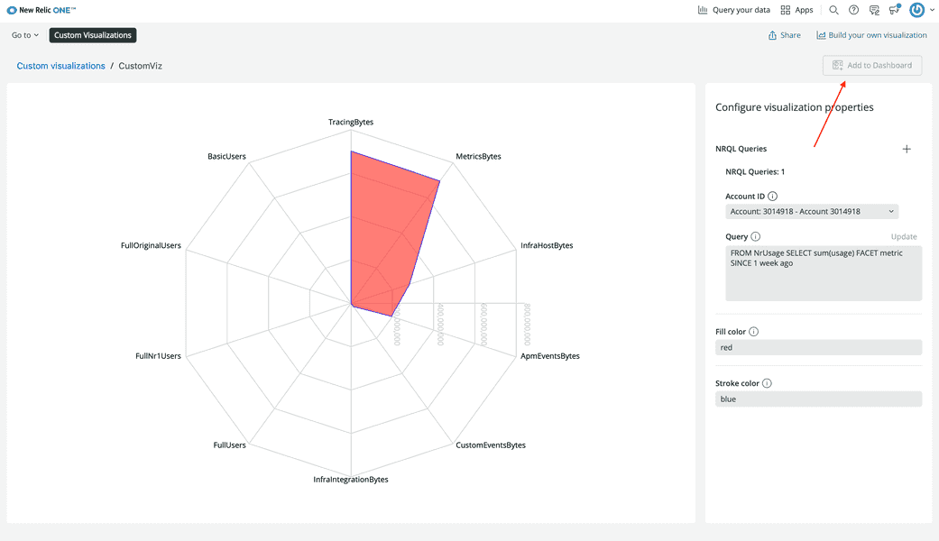
During development, you can serve your visualization locally. Under Apps > Custom Visualizations, you can view and configure your visualization to see how your data looks, but you can't instantiate that chart and use it in your account:

To do that, you need to publish it to the New Relic app catalog and subscribe to it from your account.
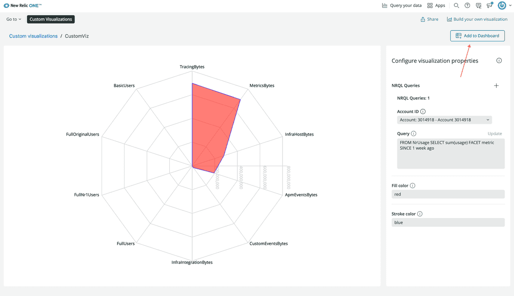
Because custom visualizations are Nerdpack items, you publish and subscribe to them the same way you publish and subscribe to New Relic applications. Once you've done so, you can add your custom visualization to a dashboard:

If you want to reuse your visualization to present different data or the same data in a new way, you can go back to Apps > Custom Visualizations, choose your visualization, configure another instance and add it to your dashboard:

Resources
Here is a list of resources for using custom visualizations: