Course
This lesson is part of a course that teaches you how to build a New Relic application from the ground up. If you haven't already, check out the course introduction.
Each lesson in the course builds upon the last, so make sure you've completed the last lesson, Serve your New Relic application, before starting this one.
The New Relic application that you're building throughout this course allows developers to A/B test their websites. To run a successful A/B test, site owners need to be able to analyze the results. Without knowing how each design performs, how will developers determine which design to use?
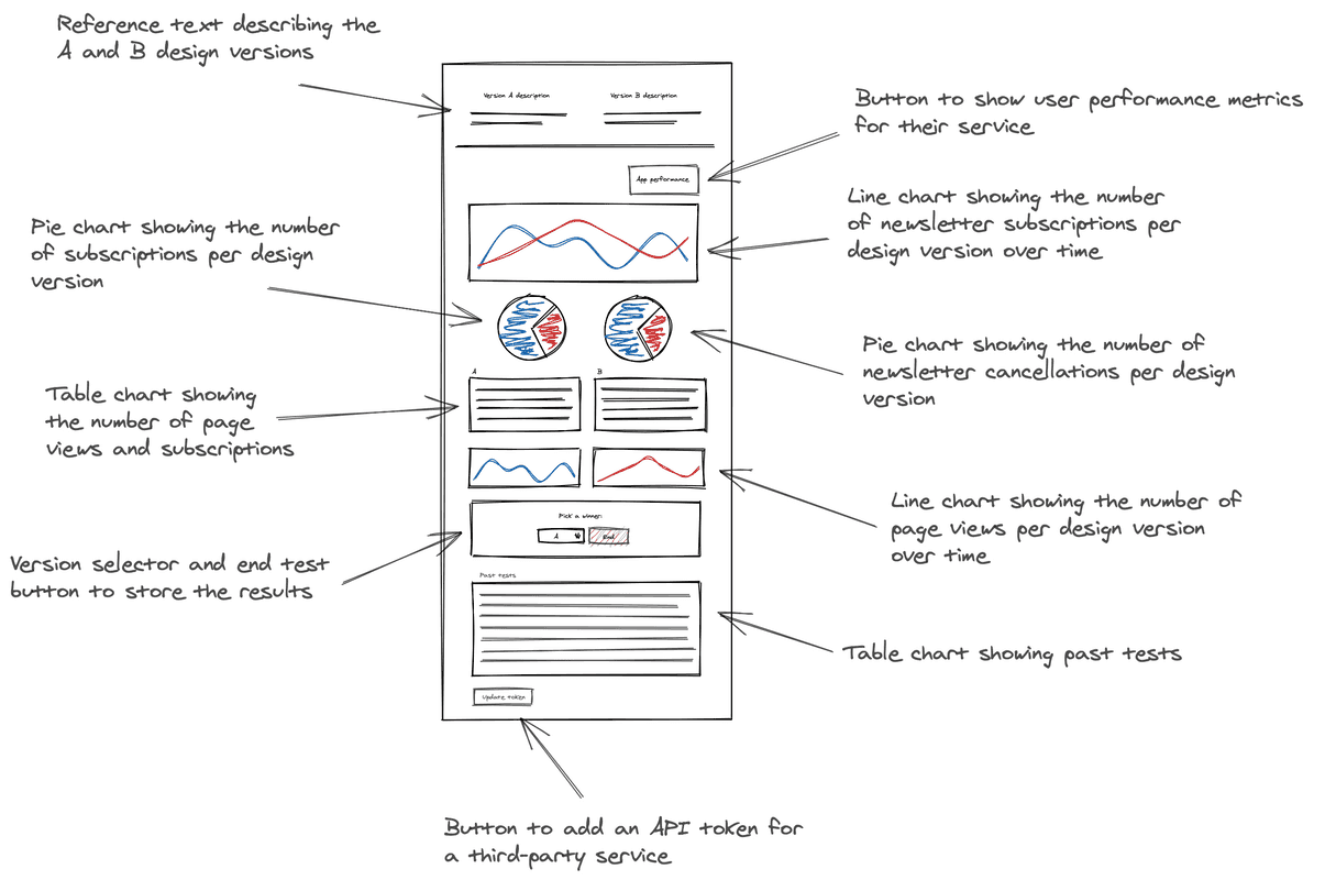
Here is a mockup for the A/B test application you're building:

Your application displays data for two competing versions. With various charts and tables, your users will be able to analyze the results of their test and make informed decisions on which design will work best to achieve their goals.
You’ll refer back to this mockup many times throughout this course. It shows you what charts to create, how to organize them, and what kind of data to provide them. In the next four sections, you learn how to create every chart that your A/B test application needs to operate effectively. After that, you’ll arrange the charts to match the mockup’s design and supply New Relic data collected from the demo applications you spun up earlier.
Course
This lesson is part of a course that teaches you how to build a New Relic application from the ground up. Continue on to the next lesson: Add your first chart.